
GT’s Synergy Raw Kombucha
GT is a leader in fermented beverages, known for its commitment to real, raw, and living foods. This speculative redesign reimagines GT's Synergy identity to better communicate their commitment to living foods for optimal health. The new designs offer a visual representation of the vibrant, dynamic nature of raw, living products, opting for a cleaner, bolder representation that still evokes the brand's commitment to wellness.


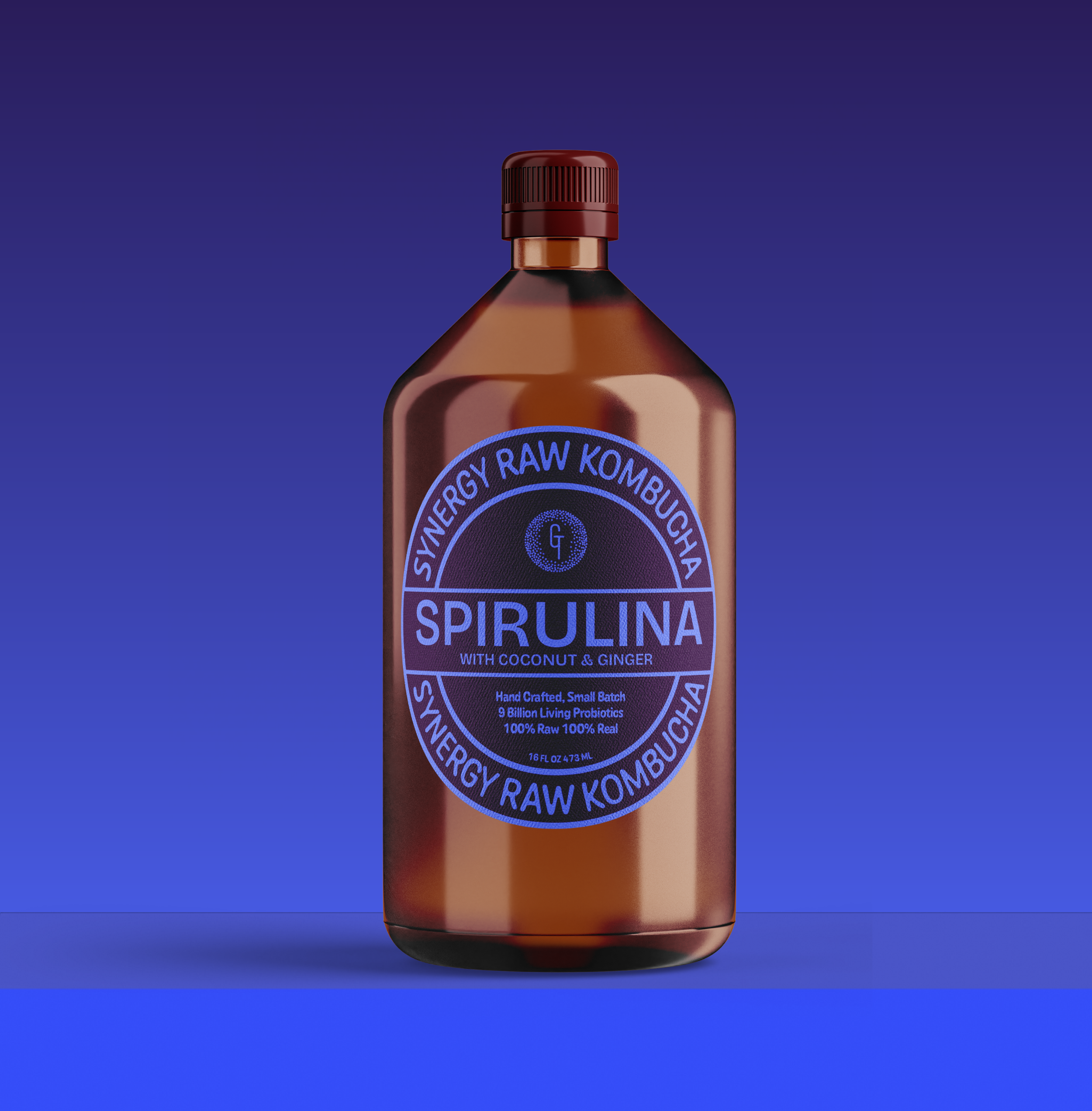

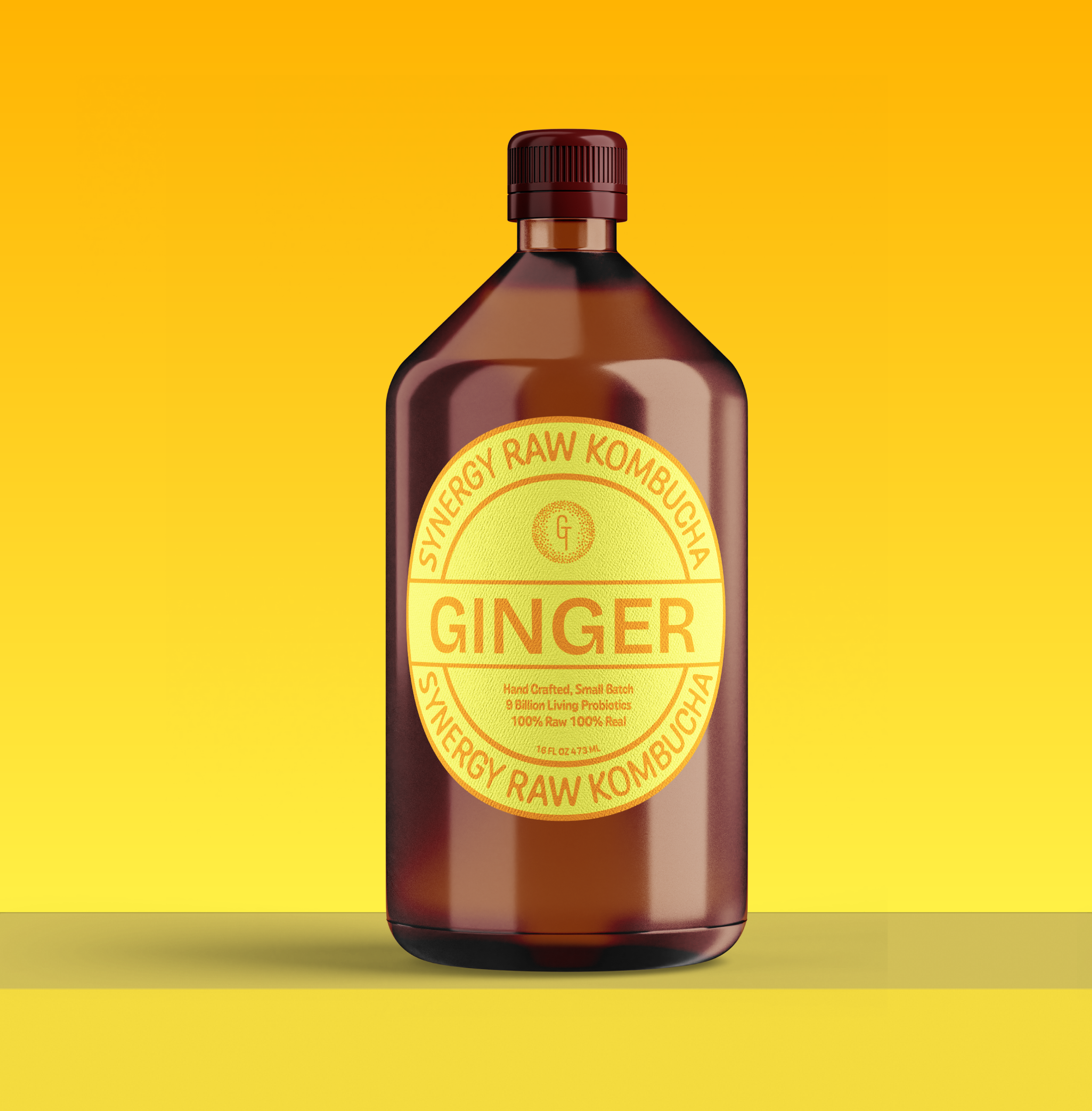
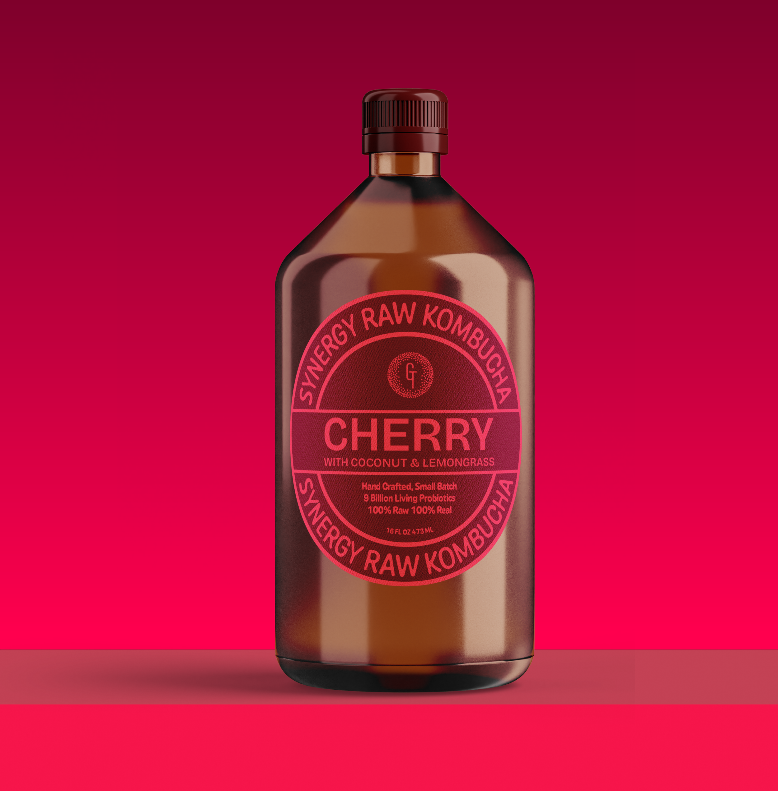
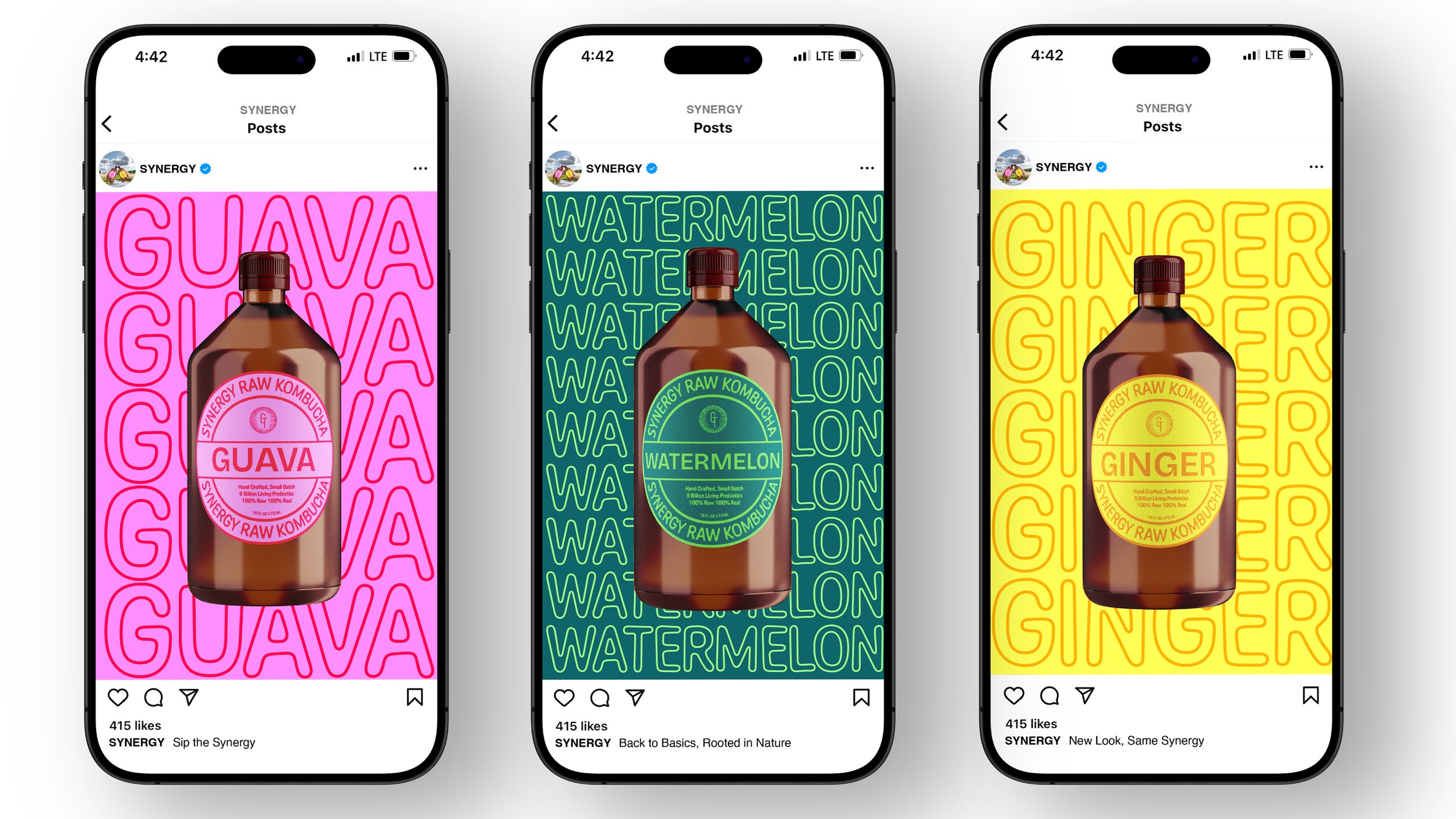
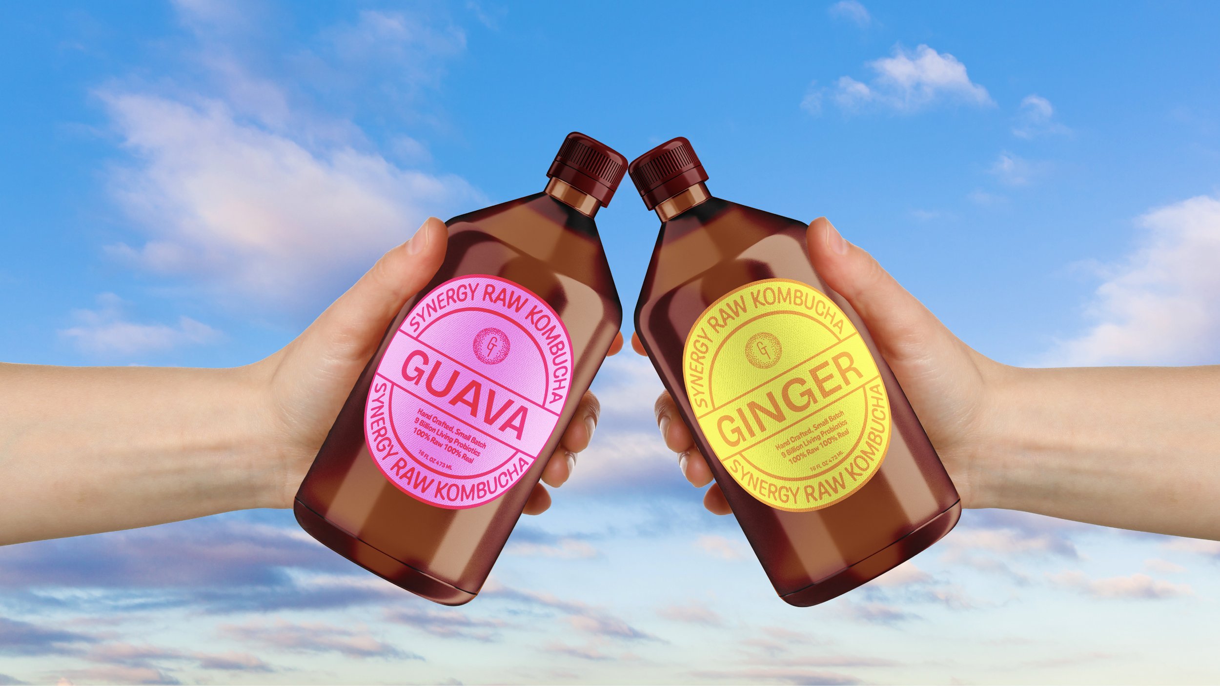
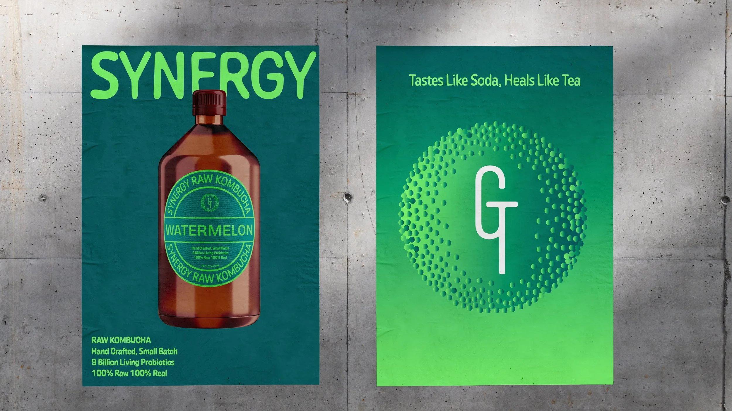
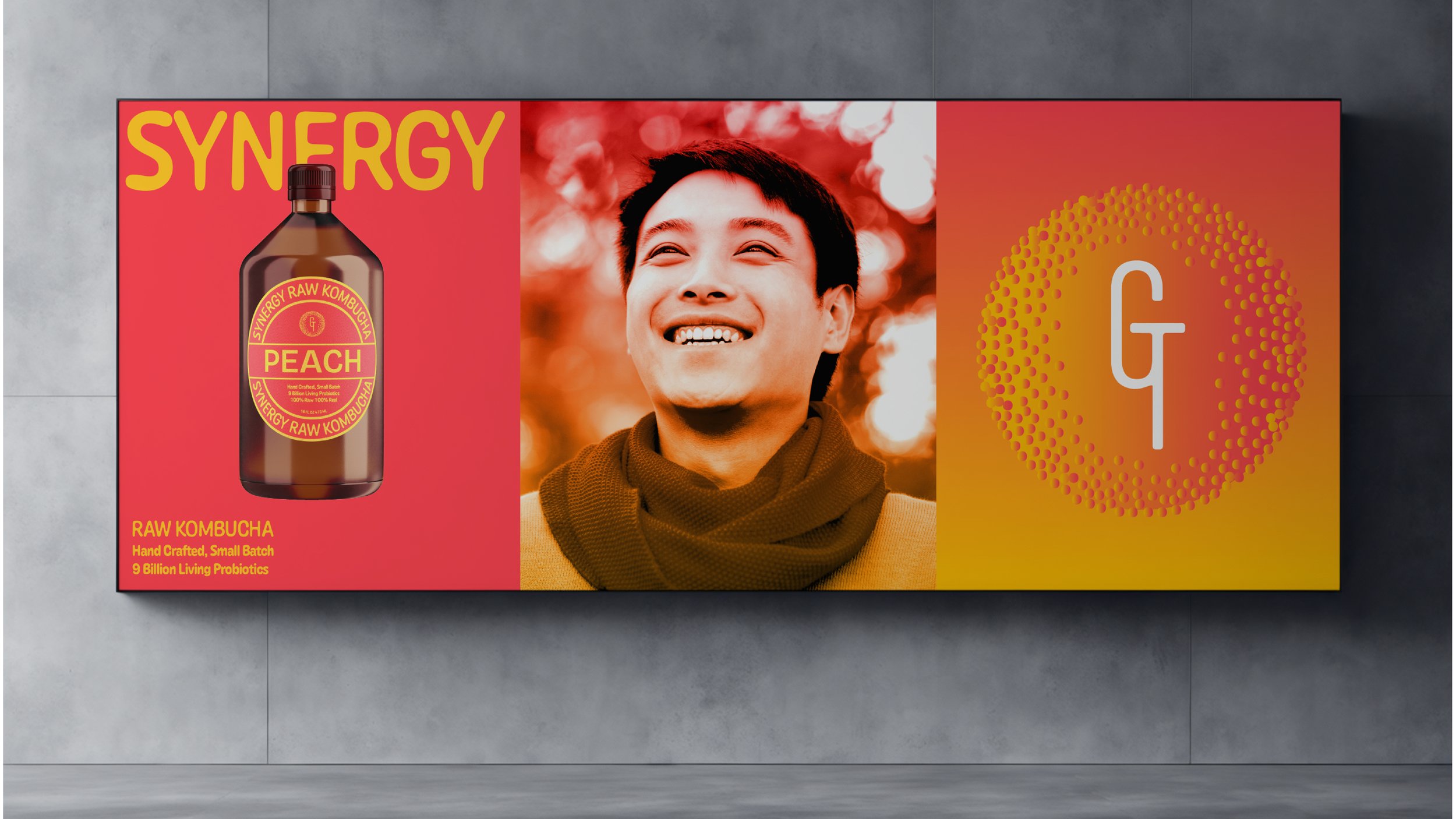
The refined logo emphasizes "GT" for a stronger, more memorable mark, with dots arranged in a circular pattern symbolizing beneficial microorganisms found in kombucha. Intertwined 'G' and 'T' at the center represent symbiotic relationships found in nature. Multiple logo variations offer versatility while maintaining brand consistency across applications. Amber glass bottles evoke apothecary containers while protecting kombucha from light degradation. The juxtaposition of bold Bricolage Grotesque for flavor names against fluid Caraque Melted typeface mirrors a traditional living food in contemporary context. Medallion-like labels suggest distinction while representing wholeness and the cyclical nature of fermentation. Textured paper materials reinforce connections to artisanal processes and create sophistication on store shelves.
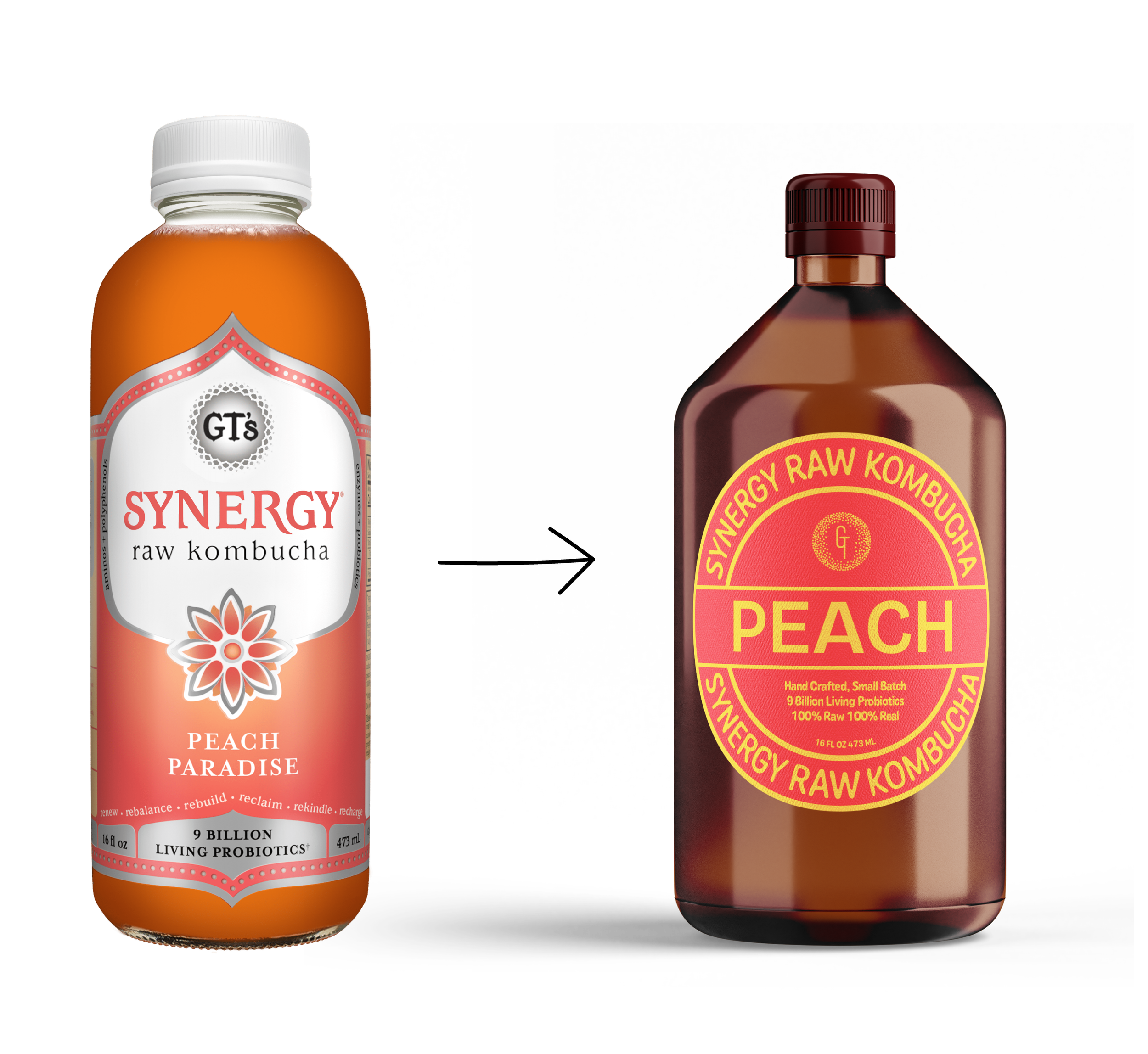


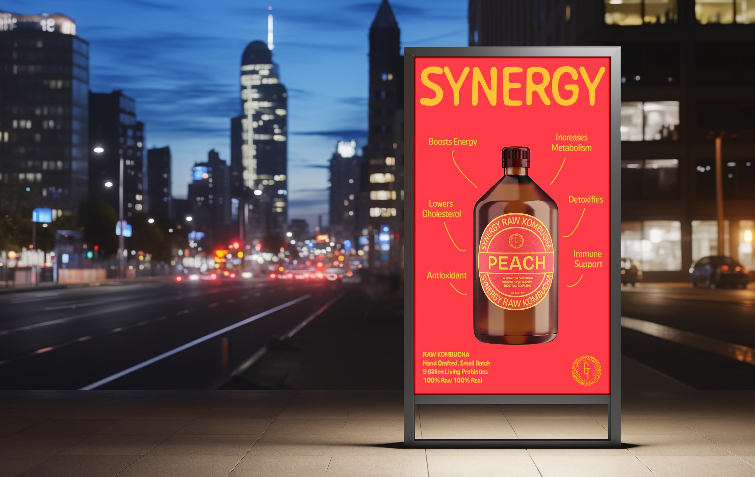
The conceptual approach shifts product naming from abstract titles like "Sacred Life" and "Guava Goddess" to straightforward flavor descriptors. This evolution prioritizes consumer understanding, allowing for quicker, more informed purchasing decisions. Each label's duochrome palette evokes the natural vibrancy of ingredients while creating visual consistency. This design exploration demonstrates how embracing clarity can show confidence in raw ingredients while making products more accessible to modern consumers.